The source to the thesis is now available. This might be useful to people wanting to see what a thesis looks like from the inside (after being edited from multiple source and multiple authors). The .tex files aren’t a pretty sight, with more comments, deleted paragraphs and rubbish than I’d really like.
Most of the images were created using inkscape, and would be best edited using the same.
I used svg-latex for images. The setup will reprocess any svgs, using a command line call to inkscape. This means that latex has to be configured to run scripts (enable write18 is the magic google search).
I’m sorry but I don’t have a record of all the latex packages required for the build. Those that aren’t in source are available in Ubuntu package manager.
There are some strange transparency rendering bugs in some images in the Chrome pdf viewer (below left). Adobe and Ubuntu Document Viewer (below right) handle them fine.
Early animations from my PhD. How a computer scientist might program building geometry. CGA / Split shape grammar, physically engineered, designed, and grown (which was the topic of my PhD…).
In celebration of finally getting my work into a decent journal, I decided to have a look back to see how the paper developed over time.
City Architecture Generation ( Master’s Dissertation 2006 | pdf )
Way back in the past I was doing a degree at bristol, and wrote my dissertation on an interesting concept for architecture generation. This original document is very flawed, and the results quite rough, however the code (just about) worked. I seem to remember it being a few months work. I got a decent enough grade for it at the time, so was happy enough.
The important thing is it gave me enough of an insight into a new & useful technique. I went off into work in the real world for a few years, and thought about the project again every now and then. Then I decided to head back to academia, and start over again with a PhD…
The fun results are on page 75.
The Extrusion Skeleton for Procedural Architectural Modeling ( Eurographics 2009 | pdf ) rejected
For the 9 months or so, I messed around with a few systems, and finally got the straight-skeleton system working to the point where I was reasonably happy with it.
We decided a couple of weeks before the deadline to really go for the Eurographics submission. We made great progress in two weeks, but the reviewers rightly rejected it as being sloppy.
The summary we got back from CGF:
“The paper presents a simple interactive procedural method to create a variety of architectural shapes. The core of the method generalizes the existing ”straight skeleton” algorithm for computing roof shapes, by (a) allowing different slopes on each edge of the input polygon, and (b) by allowing edits on the polygon ”during” the algorithm. An easy to use interface is proposed.
The reviewers consider that this paper proposes a number of incremental but very useful additions to existing methods in the area. These additions are carefully selected and blend well together, the method is nicely integrated in a functional interactive systems and produces impressive results.
Unfortunately, the paper has major problems: the presentation is confusing, the algorithmic description is sloppy and contains several errors, and the method has not been carefully evaluated. Cleaned up, the reviewers think this paper could be useful to the community. However the required revisions are major and the paper cannot be considered for the Eurographics conference.”
Other comments:
“I definitely miss references to interactive sketching systems, such as SESAME and Sketch-up, and to have a discussion on this issues. Since the main focus of the paper is on interactive design, the real comparison is with interactive systems, not only grammar-based systems.”
“The proposed extensions to straight skeletons seem to be of limited novelty. Some of the extensions (like multiple footprints and the avoidance of ”angle restrictions”) appear to be done before. Other extensions (multiple wall profiles, plan edits and robust computation) might be novel. However, they are mostly straightforward and represent only a minor contribution for a Eurographics paper.”
“This is actually very good except where it isn’t.”
Interactive Architectural Modeling with Procedural Extrusions ( Siggraph Asia 2010 | pdf ) rejected
The next deadline we wanted to try for was Sigg-Asia. The big step here was getting it to work over a large input set to make the pretty first figure. We made an attempt to add some comparisons to existing modeling techniques. As ever I ran out of time trying to submit, and didn’t manage a video (the editor kept crashing at the last minute).
In the reviews I took a lot of heat for the lack of an evaluation and the picture of my co-author hidden in the paper. But the thing that really killed it was us pretending that we had a perfect geometric algorithm when there were (rare) situations where it would fail. I think these are the original reviews.
Reviewer summary:
“1. The paper doesnt provides an algorithm in the proper sense of the word. You present a set of heuristics that works on a large set of models. This can be very useful from the modeling perspective as the user is in the loop to fix the degenerate results. Please try to make this clear early on, and in the review cycle we want to agree on this change in exposition style.
2. In computational geometry the stress is to present provable algorithms. Hence, in many cases the algorithms end up complicated to implement to address various degenerate inputs. This is not the case for the modeling scenario where the user can update the inputs in case of failures. Again this distinction should be clear in the paper.
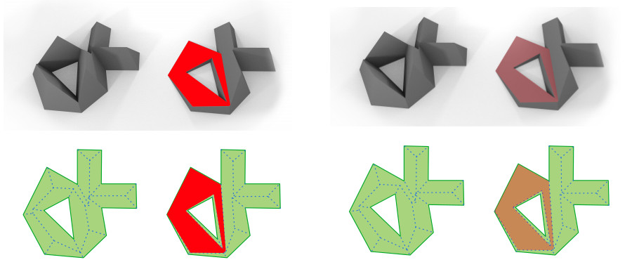
3. Please remove figure 25, it weakens the paper.
4. Please perform a proper evaluation. Take a large number 50-100 floor plans from some publicly available repository, and use your framework to come up with buildings there. It will be excellent if you can use google streetview or like to take existing building profiles and try to replicate them. In your rebuttal you already mentioned about cities where such complicated roof structures are common. We feel the work will have an important effect in this area, so we want to see this in a form that is easy to understand and judge.”
Other comments:
“You need to be very careful about using a single word or term for each concept: you can’t have a priority queue that becomes a priority list; you can’t have a wall-angle that becomes a weight, and so on. “
“I’ve suggested that the introduction should discuss an experiment that tests the generality of your system. Providing this support for your claim of a good working system — support with solid factual evidence — would be the best service you could possibly perform. The reviewers agreed that the way to do this is to take a collection of house-plans (for example, go to XXX.com”
“The algorithm is interesting, but the scope is rather restricted. While it is true slanted roof structures and similar extrusions (figure 22) make the models realistic, but it is unclear if such a specialized and general algorithm is required. It may be sufficient to have a template based model. “
“Overall this paper presents a powerful system able to generate complex building geometry that can be edited interactively. My concerns are with the amount of manual effort that is needed and with how well all (most?) special cases are handled. The former is empirically shown to be reasonable – ok. The latter is more unclear.”
“The main problem with this paper is in the GOAL — not of the work, but of the paper itself.”
“(I apologize for any typos or unclearness in these notes; I have wrist problems which make me not want to take the time to do any more editing than necessary.)”**
Interactive Architectural Modeling with Procedural Extrusions ( Transactions on Graphics 2011 | pdf ) accepted
We got an offer to publish our work in TOG after the Siggraph rejection, if I made the suggested corrections. This meant that I spent a lot of time on evaluation (playing with our application) – however when I was done I had a much better idea of the weaknesses and strengths of the system. I followed the suggestions of one of the previous reviews to use an online library of floor plans. In hindsight this was probably a mistake because:
Online libraries only seem to exist for plans without locations – and without interesting boundary constraints, many features of the project weren’t appreciated.
The online library didn’t give us copyright permission to also show the library of plan/images we used for the modeling process. The reviewers were able to see it, but we weren’t able to publish them. Available here (40Mb).
There was also a lot of effort done to tighten up the technical writing in the middle of the paper. One challenge was to choose an appropriate depth of explanation – too deep and you end up explaining too much, too shallow and you invite many additional questions.
The other challenge was keeping the terminology consistent throughout(!). This becomes non-trivial after so many paper drafts, and the fact the implementation (the source code) uses an entirely different set of terminology.
Of course, there are always new problems that come up with the concepts when you keep digging, one is detailed in a previous blog post.
Just for reference, here are the edits made by the ACM copy editors before the final article was drawn up. Apparently paragraphs should start on the same line, and never use “Fig. X” in the body of text, always “Figure X”:
Finally I would like to thank the many reviewers who helped us scrape this paper together. Especially the few guys that stood up for this work! It’s been an exercise in learning how these things are really done, and how they turn out under time pressure. Hopefully the next one will be a little easier on us all 🙂
** – never say this in anonymous reviews, it leads to whoever-you-are being known as “wrist guy” for the months while we redraft the paper.
In the name of badly rushed science for conference deadlines I present the accumulation of a couple of week’s evenings messing around learning about frequency space (pdf).
[tl;dr] This paper got accepted, and I “presented” it at the Sicsa 2010 conference. Here’s the video:
While I’d always seen the little bars on music amplifiers, I’d never thought of images being represented in the same way. The bars represent the frequencies being played back at any one time. The low frequencies (slower moving bars, normally to the right) are the deep sounds, and the high frequencies (fast bars on the left) are the high sounds. It turns out they have a nice analogue in the image plane, but because we don’t look at at every pixel in a photo in order from start to end over 3 minutes we never see them.
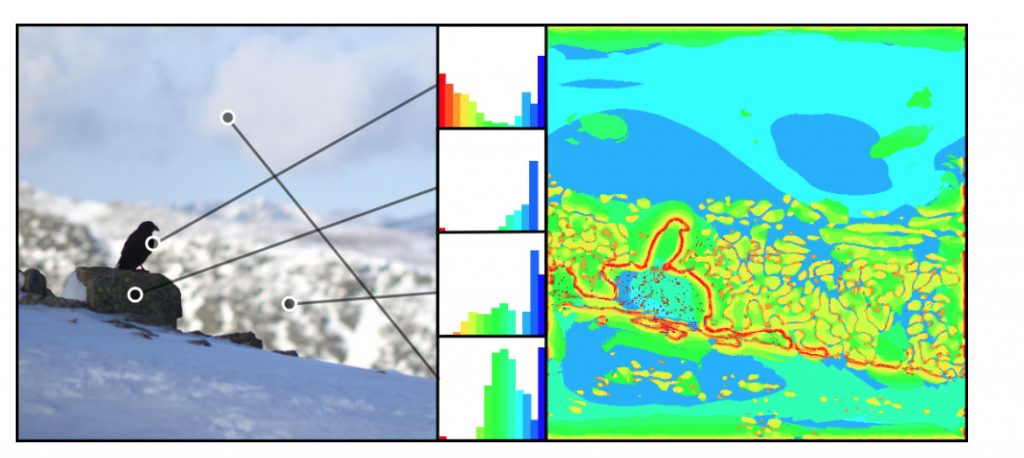
If we identify the important areas of an image for each frequency (DoG pyramid/”monolith”), we can animate over the frequency (high frequencies first, then the low ones):
We can then see that a single point in the image has different intensities at different frequencies, as the shade of grey at a point changes. So there’s one of the little bar-graphs for each pixel.
I built a little application that lets you see these graphs and the spatial frequencies in an image. It’s quite fun to play with, you can start it by clicking here (java webstart, binary file, run at your own risk, source code below). Wait for it to load the preview images, select one, wait for it to build the map (lots of waiting here…) and then use the right-drag to move around, wheel to scroll, and the left button to show a frequency preview for a particular location. Move the mouse out of the frame to see the representative frequency map from the work.
As you drag the point around the lil bars change to show you what the frequency content is like in that area of the image.
This was neat, and I had to do something with it, so I built a hoodicky that takes a single image and recovers the depth map from the focus of a single image. I assume that stuff in focus is near the camera, and stuff out of focus is a long way away – photography just like your Mum used to do. It turns out that not too much work has been done in this region, these guys even got a book article out about it last year.
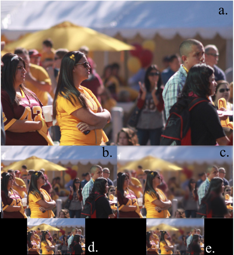
So just to late to be hot news… but interesting none-the-less. So I decided to twist the concept a bit and use it for blur aware image resizing. The motivation being that you need big (expensive) lenses to take photos with a shallow Depth of Field, but when you resize these images, you loose that depth of field:
In the smaller images, more of the logo appears to be in focus, but it’s the same image, just scaled a bit.
So we want something that keeps that proportion of each frequency the same as you scale the image. So basically it’s a thing that keeps foreground/background separation when scaling an image. We can use the focus of an image (closely connected to it’s frequencies) to determine the depth, as the video shows.
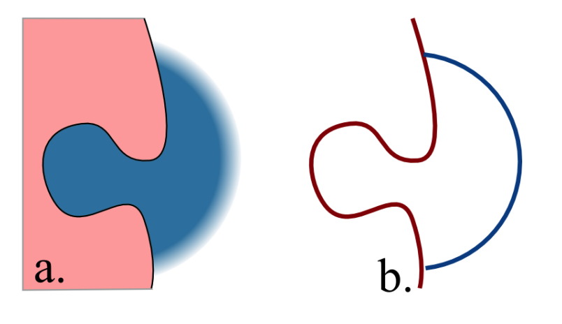
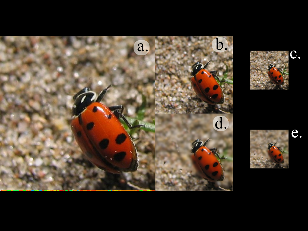
In the following, a, b and d are normal scaling, while c & e use the depth map we’ve calculated using the frequency map.
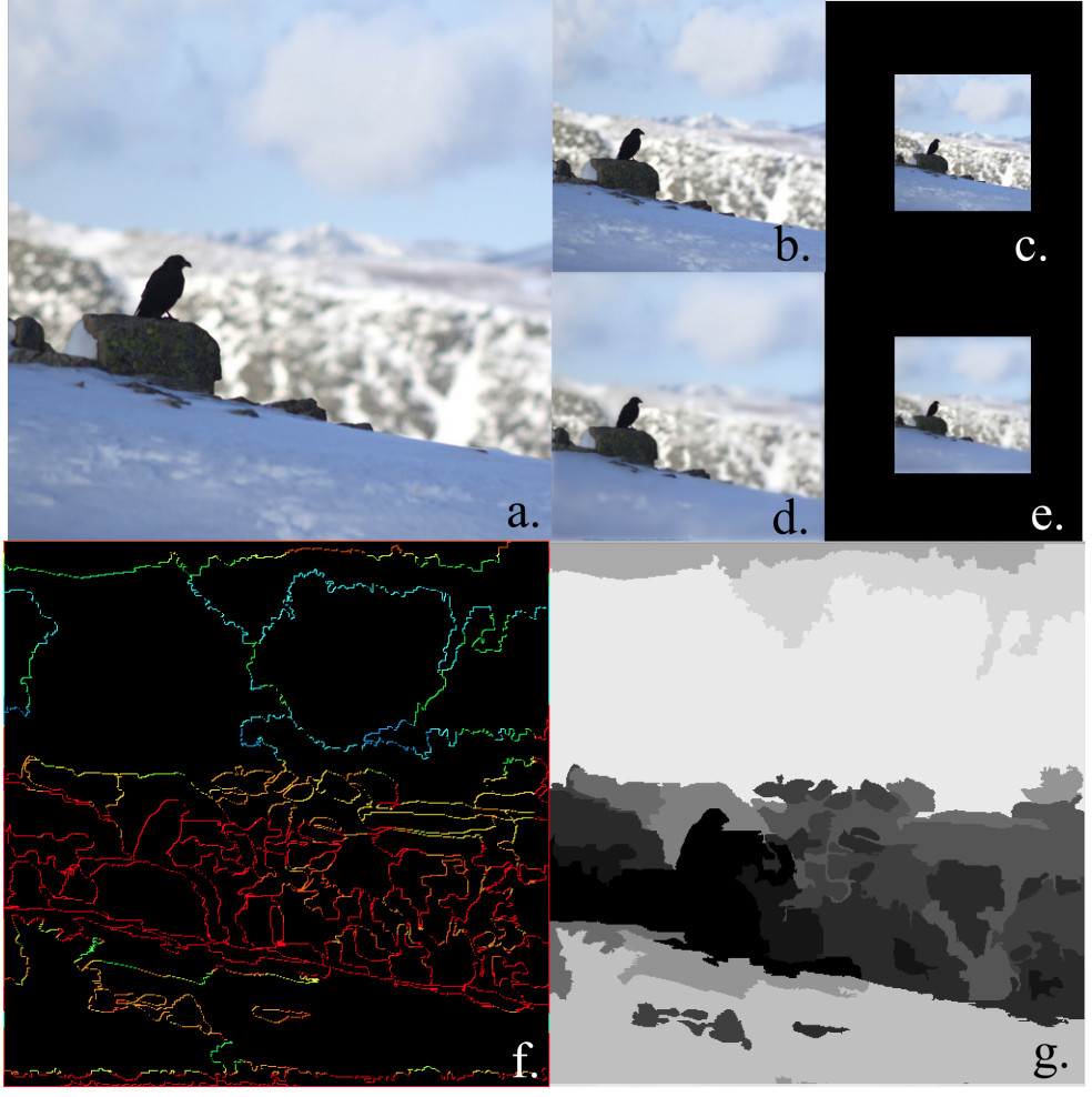
This uses the frequencies on the edges of the photo to classify the segmented image. This shows the same kind of thing at the top, and the segment-frequency map bottom left, and the recovered depth map bottom right.
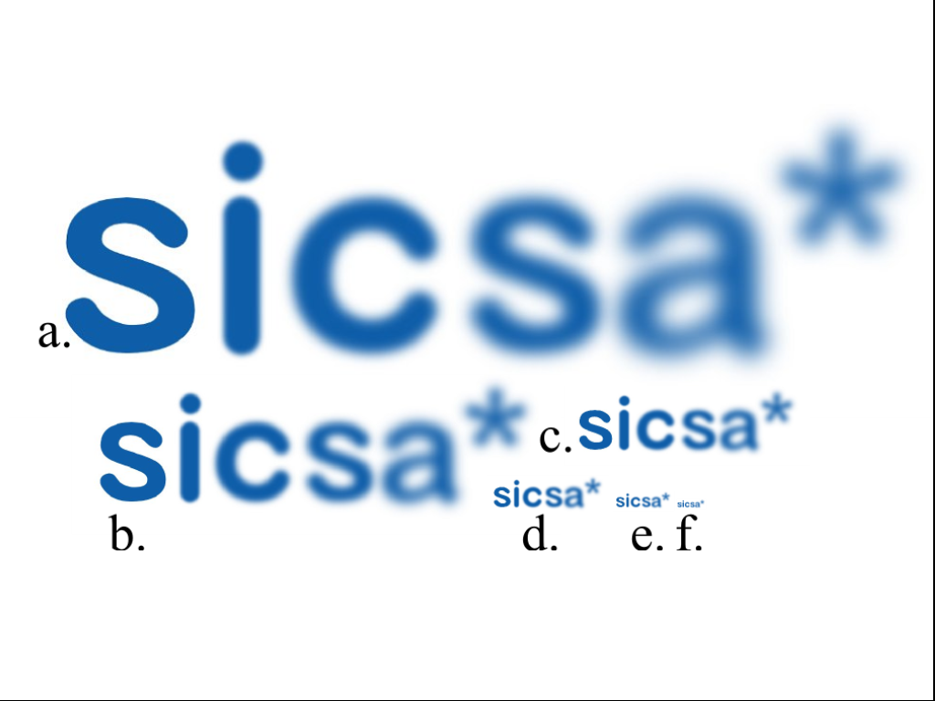
More results (SICSA are the people who pay half my rent…):
Results are better than I expected for the few days I spent putting this thing together, but the basic problem is there are two or three parameters that need to be tuned for each image to take into account the noise of the image and the bias towards foreground/background classification. Good working prototype, lots of effort required to do this for real.
The write up looks like this (pdf, src below), I’m a bit certain some of the equations are wrong – but this is computer science, no one actually reads equations do they?
Source code is here. Java. I think it uses Apache licensed stuff, that that’s how it should be treated, but I scrounged a fair bit of code, who knows where it’s from… Main class should be FrequencyMap, and after setting up an image in that class you’ll need to play around with the four constants at the top:
fMapThreshhold: Increase if not enough red (high freq) in the freq map, decrease if noise is being counted as red
scaleFac: usually okay to leave alone. If you want a frequency map with more levels, decrease this, keeping it above one.
filterRadius: noise reduction on edge classification. Increase to classify more edges as higher frequency
Q: increase to increase the number of segmentations.
It will write files out to the disk. Use at your own risk.[edit: 22/3/10]
While out riding this weekend I figured out that it should be possible to analyse the defocused edges for evidence of higher frequencies to determine if the edge is in front of, or behind the in-focus point. More importantly if we can’t see any high frequency edges in the bokeh, then it doesn’t matter if that part of the edge is in front of, or behind the defocused edge…
{edit:} woo! It’s been accepted (probably because it’s one of the few graphics papers from Scotland).
{edit: 22/3/10} While out riding this weekend I figured out that it should be possible to analyse the defocused edges for evidence of higher frequencies to determine if the edge is in front of, or behind the in-focus point. More importantly if we can’t see any high frequency edges in the bokeh, then it doesn’t matter if that part of the edge is in front of, or behind the defocused edge…